Last updated:
10 Prompts That Turn Your Building Program Into Visual Answers

Snaptrude's Chart Agent generates charts from your architectural program data with a single prompt. This post shows 10 real prompts you can use, grouped by what architects actually need to visualize during a project: area distribution, space counts, benchmarking, efficiency tracking, and more.
Why show the prompts?
We wrote about why we built the Chart Agent in an earlier post. The short version: your program already has the data, but turning it into something visual usually means exporting to Excel and building charts manually.
The best way to understand the Chart Agent is to see the actual prompts and what they produce. What follows are 10 prompts, grouped by the kind of question they answer. Each one describes what you type, what the agent returns, and when during a project it's most useful.
Area distribution
"Analyze space allocation by department"
This is the most common prompt. The agent reads your program, totals the area for each department, and generates a bar chart with departments on one axis and area (in your project's units) on the other.
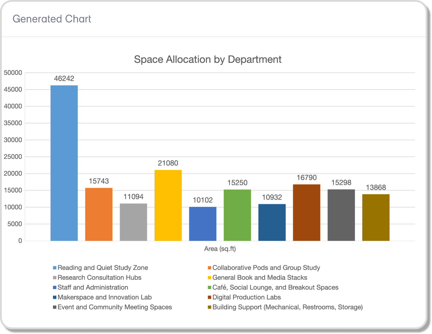
You see immediately which departments are taking up the most space. On a 176,000 sqft library program, for example, the chart might show Reading and Quiet Study at 46,000 sqft while Research Consultation sits at 11,000. That ratio is hard to feel in a table. It's obvious in a bar chart.
When it's useful: Early program reviews with the client. Before the first design review. Any time someone asks "is this program balanced?"
"Show department area as a percentage of total"
Same data, different view. The agent generates a donut or pie chart showing each department's share of the total program area. Color-coded by department, with percentages visible.
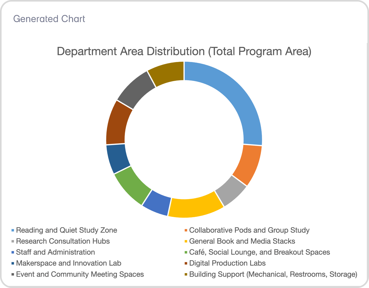
This is useful for a different kind of conversation. Instead of "how big is each department," you're asking "what fraction of this building goes to each function?" That's the question clients and developers tend to ask.
When it's useful: Developer presentations. Feasibility reviews where the question is about proportions, not absolutes.
"Plot area by department and floor"
The agent generates a stacked bar chart showing how each department's area distributes across floors. You see the vertical distribution of the program at a glance.
This is one of the prompts that's hard to replicate quickly in Excel, because it requires combining department data with storey assignment data. The Chart Agent reads both from your program and handles the grouping automatically.
When it's useful: After storey assignment. When you're checking whether the vertical stacking makes sense before moving to design.
Benchmarking
"Compare my allocation against industry standards"
This is the prompt that tends to surprise people. The agent doesn't just visualize your data. It generates a comparison chart with paired bars: your program's allocation next to a typical benchmark for the same typology.
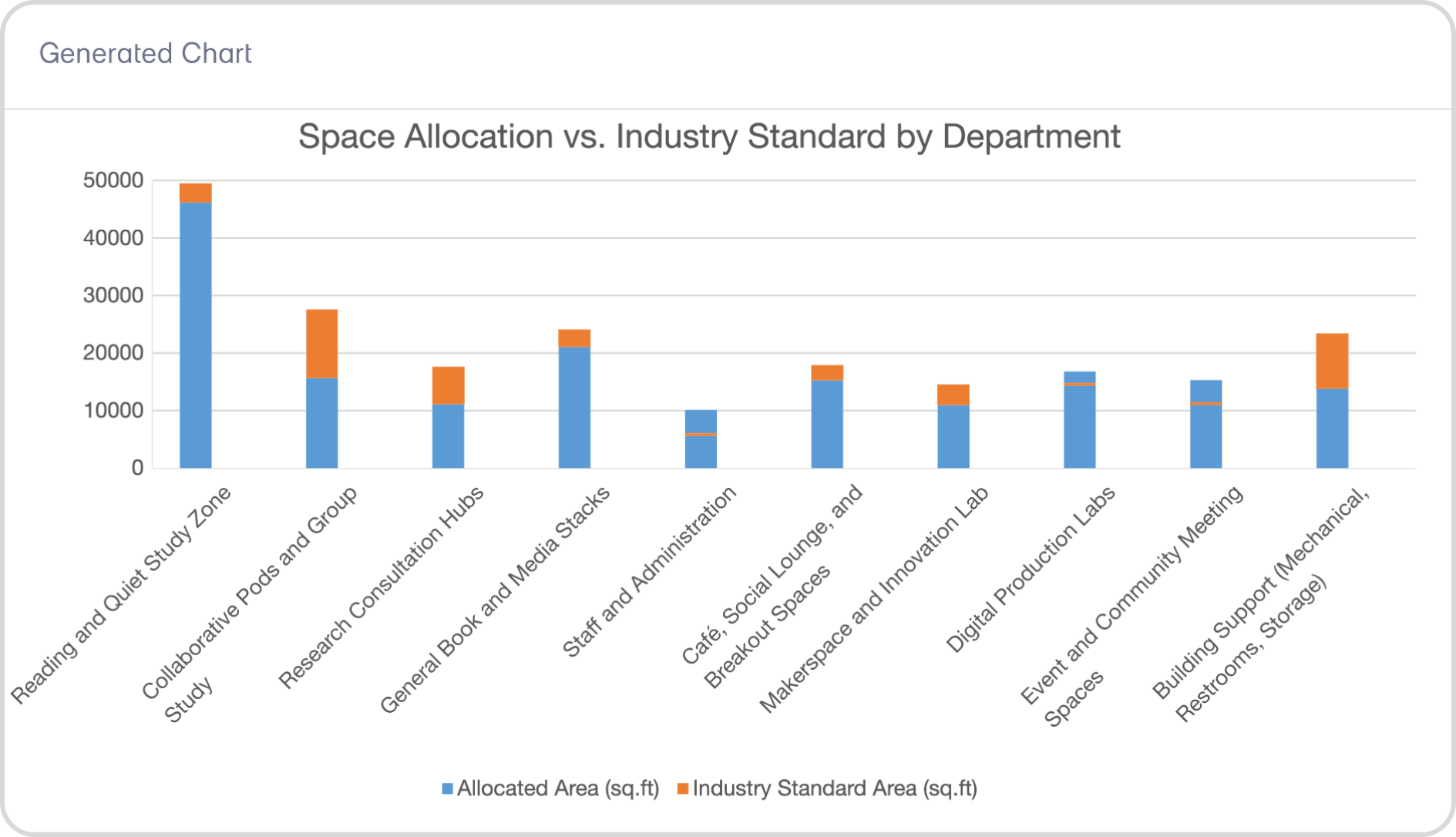
If you're working on a hospital, it compares your department areas against FGI and Neufert benchmarks. For an office, it references BOMA. For a school, it pulls from A4LE and Neufert guidelines. The Research Agent supplies the standards knowledge, and the Chart Agent turns the comparison into something visual.
When it's useful: Program validation. When a principal needs to confirm that the program is reasonable before committing to design. When you're presenting to a client who wants to know how their project compares.
"How does my net-to-gross ratio compare to typical for this typology?"
The agent calculates your project's net-to-gross efficiency and charts it alongside the standard range for your building type. A healthcare project might show your ratio at 58% against a typical 55-65% range. An office might show 72% against 65-75%.
When it's useful: Feasibility discussions. When the developer or client is asking about efficiency and you need a quick visual answer grounded in real benchmarks.
Space counts and distribution
"Show space count by department"
A simple bar chart showing how many individual spaces each department contains. Useful for understanding program complexity, not just area. A department with 5 large spaces and a department with 40 small spaces might have similar total areas, but very different design implications.
When it's useful: Planning workload. Understanding which parts of the program will require the most layout effort.
"Create a chart of the top 20 spaces by area"
The agent ranks all spaces in the program by area and charts the top 20. This highlights the spaces that drive the most square footage in the project. On a hospital, you might see that operating rooms, patient wards, and the main lobby dominate. On a school, it might be gymnasiums, auditoriums, and cafeterias.
When it's useful: Prioritization. When the team needs to decide which spaces to design first because they have the biggest impact on the overall layout.
Net, gross, and efficiency
"Show net vs gross area by department"
The agent generates a grouped bar chart with two bars per department: net area and gross area. The gap between them is your circulation, walls, and structure. You see efficiency visually, department by department.
If you've been working with Snaptrude's real-time feasibility tools, these numbers are already tracked in the Area Panel. The Chart Agent just makes them visible in a way that's easy to present.
When it's useful: Internal design reviews. When the team is checking whether efficiency targets are being met across the program.
"Plot achieved area vs target area by department"
A comparison chart showing what each department was supposed to be (target) versus what it actually is (achieved). Departments that are over-target show immediately. Departments that have room to grow are equally clear.
When it's useful: Mid-project program checks. When the program has been through several rounds of edits and the team needs to see where things stand relative to the original brief.
Custom data
"Visualize the data in my imported Excel sheet"
If you've imported external data (client requirements, benchmark data from a previous project, cost estimates), the agent can chart it directly. You don't need to restructure the data or match it to a specific format. The agent reads the column headers and values and generates a chart.
This is especially useful for firms that maintain their own internal benchmarking databases or receive programs from clients in Excel format.
When it's useful: Anytime you have data in your project that isn't in the standard program table but needs to be visualized.
Key Takeaway: These 10 prompts cover the most common visualization needs during a project: area distribution, benchmarking, space counts, efficiency tracking, and custom data. Each one works from your live program data with no exporting required.
How charts fit into the broader workflow
The Chart Agent works inside Snaptrude 3.0's connected environment, alongside the other agents. The Site Analysis Agent handles zoning and site data. The Research Agent handles code and standards lookups. The Chart Agent turns whatever data you have into something you can see and present.
In practice, the Chart Agent is the one you use when you need to answer a question visually. Not at the end of a project for a final presentation, but in the middle, when the numbers are still changing and the team needs to understand the shape of the program as it evolves.
That shift matters. When charts are easy to generate, you make them earlier, more often, and for smaller decisions. You don't wait until the program is "final" to visualize it. You visualize it while it's still being shaped, which means better decisions at the stage when they cost the least to change.
Ask a question. Get a chart.
Every one of these prompts takes seconds. The same visualization in Excel would take 20 to 30 minutes of exporting, formatting, and chart-building. On a project where the program changes weekly, that time adds up fast.
The Chart Agent keeps the visualization connected to the data. You ask, you see, you decide.
The Chart Agent is live in Snaptrude. Try it on your next project.
Related reading
- Top 18 AI Tools for Architects in 2026
- AI Agents for Architectural Programming: What They Do and Why We Built Them
- When Spreadsheets Become Design Intent (and Why That Has Been the Problem All Along)
- Your Program Has the Data. Now You Can See It.
Frequently Asked Questions

